

Fulfilment Dashboard Design: What Ops Leaders Should See Daily, Weekly and Monthly
A good fulfilment dashboard should help operations leaders see what is happening, understand where risk is building, and decide what action to take next.
Many businesses have reports, spreadsheets and system exports, but still lack real operational visibility. Data exists, but it is not always organised in a way that helps COOs, Ops Directors, Warehouse Managers, Customer Service teams and Finance leaders run the fulfilment operation properly.
This guide explains how to design fulfilment dashboards that are useful daily, weekly and monthly — and how to avoid creating dashboards that look impressive but do not drive better operational decisions.
What is a Fulfilment Dashboard?
A fulfilment dashboard is a structured view of the key metrics, risks and operational signals that show how fulfilment is performing.
In simple terms, a fulfilment dashboard answers questions such as:
- Are orders flowing through the operation as expected?
- Are we at risk of missing dispatch promises?
- Where is backlog building?
- Are stock issues delaying orders?
- Are picking, packing and dispatch working at the required pace?
- Are exceptions under control?
- Are carriers performing as expected?
- Are returns, rework and errors increasing?
- Is fulfilment cost under control?
A fulfilment dashboard should sit at the centre of wider fulfilment KPIs, because it turns operational data into visibility and action.
Why Fulfilment Dashboard Design Matters
Dashboard design matters because not all metrics are useful at the same time, for the same audience, or at the same level of detail.
A Warehouse Manager needs live order flow and backlog visibility. A COO may need trend, capacity, cost and service performance. Customer Service needs order status and exception visibility. Finance may need labour cost, carrier cost, returns cost and fulfilment cost per order.
A poorly designed dashboard can create problems such as:
- Too many metrics and no clear priority
- Vanity numbers that do not trigger action
- No separation between daily control and monthly reporting
- No view of exceptions or blocked orders
- No link between warehouse performance and customer impact
- Data that is too late to be useful
- Teams arguing over different versions of the truth
The best dashboards are not just reports. They are operational control tools.
Good Fulfilment Dashboard vs Weak Fulfilment Dashboard
| Weak Dashboard | Better Dashboard |
|---|---|
| Shows lots of numbers without priority | Highlights what needs attention now |
| Only reports yesterday or last month | Shows live or timely operational risk |
| Only measures shipped orders | Shows orders by stage, backlog and exceptions |
| Uses averages that hide problems | Segments by channel, warehouse, order type and reason code |
| Designed for reporting upwards only | Designed to help teams act |
| No owner for issues | Connects metrics to actions and accountability |
The Three Levels of Fulfilment Dashboard
A strong fulfilment dashboard structure usually has three levels:
| Dashboard Level | Purpose | Main Audience |
|---|---|---|
| Daily control dashboard | Run today’s operation and spot risk early | Warehouse Manager, Ops Manager, Customer Service |
| Weekly performance dashboard | Review trends, root causes and improvement actions | Ops Director, COO, Warehouse Manager, Inventory, Customer Service |
| Monthly leadership dashboard | Track strategic performance, cost, capacity and service outcomes | COO, MD, Finance, Board, Senior Leadership |
Each level should use different metrics and different levels of detail. A dashboard that tries to do everything for everyone usually becomes cluttered and less useful.
1. Daily Fulfilment Control Dashboard
The daily dashboard should help the team run today’s operation.
It should answer:
- How many orders need to ship today?
- How many are waiting to pick?
- How many are picked but not packed?
- How many are packed but not dispatched?
- Which orders are close to carrier cut-off?
- Which orders are blocked by stock, carrier, address or system issues?
- Which teams or areas need help now?
This dashboard should be practical, timely and action-focused. It is not a board report. It is a control panel for the day.
Daily Dashboard Metrics
| Metric | Why It Matters |
|---|---|
| Orders due for dispatch today | Shows today’s fulfilment demand |
| Orders waiting to pick | Shows picking workload |
| Orders picked but not packed | Highlights packing bottleneck risk |
| Orders packed but not dispatched | Highlights dispatch or carrier handover risk |
| Orders close to carrier cut-off | Shows immediate dispatch risk |
| Open exceptions | Shows blocked work requiring intervention |
| Failed picks | Shows stock accuracy or replenishment issues |
| Backlog by age | Shows delayed orders and customer promise risk |
For deeper dispatch risk measurement, read: On-Time Dispatch Rate: How to Measure and Improve It.
2. Weekly Fulfilment Performance Dashboard
The weekly dashboard should help leaders understand performance trends and root causes.
It should answer:
- Did fulfilment performance improve or decline this week?
- Which issues created the most service risk?
- Which channels, warehouses or order types caused the most pressure?
- Did backlog increase or reduce?
- Are errors, returns or exceptions increasing?
- What action should be taken next week?
The weekly view should not just report numbers. It should support a performance review rhythm with actions, owners and follow-up.
Related guide: How to Run a Weekly Fulfilment Performance Review.
Weekly Dashboard Metrics
| Metric | Why It Matters |
|---|---|
| On-time dispatch rate | Shows whether dispatch promises were protected |
| Order accuracy rate | Shows whether customers received the correct orders |
| Perfect order rate | Combines speed, accuracy and customer experience |
| Backlog trend | Shows whether delayed work is improving or worsening |
| Exception rate | Shows hidden operational friction |
| Failed pick rate | Shows inventory or replenishment problems |
| Returns by reason | Shows fulfilment, product, carrier or customer-choice issues |
| Carrier performance | Shows whether delivery partners are meeting expectations |
For backlog measurement, read: Backlog Metrics: How to Measure Fulfilment Risk Before Customers Complain.
3. Monthly Leadership Dashboard
The monthly dashboard should help senior leaders understand whether fulfilment is supporting growth, margin and customer experience.
It should answer:
- Is fulfilment performance improving as volume grows?
- Is fulfilment cost per order under control?
- Do we have enough capacity for expected demand?
- Are service levels strong enough by channel?
- Are returns, rework or exceptions damaging margin?
- Where should we invest next — people, process, space, systems or automation?
This dashboard should be more strategic than the daily dashboard. It should help leadership decide where to improve and where to invest.
Monthly Dashboard Metrics
| Metric | Why It Matters |
|---|---|
| Order volume by channel | Shows where demand is coming from |
| Fulfilment cost per order | Shows operational margin pressure |
| Labour cost per order | Shows labour efficiency and cost trend |
| Capacity utilisation | Shows whether the operation has room to grow |
| Perfect order rate | Shows end-to-end customer promise performance |
| Returns cost and write-off value | Shows post-dispatch cost and stock recovery impact |
| Exception trend | Shows whether operational complexity is increasing |
| Carrier cost-to-serve | Shows true delivery cost beyond headline rates |
For cost measurement, read: Fulfilment Cost Per Order: How to Calculate and Reduce It.
Dashboard Design by Role
Different roles need different dashboards. A single view is rarely enough.
| Role | Most Useful Dashboard View |
|---|---|
| COO / Operations Director | Service level, cost, capacity, backlog, exceptions and trend visibility |
| Warehouse Manager | Orders by stage, pick/pack progress, failed picks, labour and carrier cut-offs |
| Customer Service Manager | Delayed orders, exceptions, tracking issues, returns and customer-impacting risk |
| Inventory Manager | Failed picks, stock discrepancies, cycle count variance, replenishment and availability |
| Finance | Fulfilment cost per order, labour cost, carrier cost, returns cost and write-offs |
COO / Ops Director Dashboard
A COO or Ops Director needs to understand whether fulfilment is under control, scalable and commercially sustainable.
Useful metrics include:
- Order volume by channel
- On-time dispatch rate
- Perfect order rate
- Backlog by age and channel
- Exception rate and trend
- Fulfilment cost per order
- Capacity utilisation
- Labour efficiency
- Returns cost and fulfilment-failure returns
- Carrier performance by service and region
This view should combine operational health, customer promise and cost control.
Warehouse Manager Dashboard
A Warehouse Manager needs a more live and practical view of today’s workload.
Useful metrics include:
- Orders waiting to pick
- Orders picked but not packed
- Orders packed but not dispatched
- Orders close to carrier cut-off
- Pick rate and pick accuracy
- Orders packed per hour
- Failed pick rate
- Open exceptions
- Labour available vs required
- Backlog by fulfilment stage
For warehouse productivity measurement, read: Warehouse Productivity Metrics: What to Track Without Creating Bad Behaviour.
Customer Service Dashboard
Customer Service needs visibility of customer-impacting fulfilment risk.
Useful metrics include:
- Orders delayed beyond promise
- Orders not yet dispatched but due today
- Orders stuck in exception
- Tracking update failures
- Late delivery issues
- Returns awaiting action
- Replacement orders awaiting dispatch
- Customer contact caused by fulfilment issues
This helps customer service teams respond with confidence instead of chasing warehouse updates manually.
Inventory Dashboard
The inventory dashboard should show whether stock can be trusted and whether stock issues are affecting fulfilment.
Useful metrics include:
- Inventory accuracy percentage
- Location accuracy
- Failed pick rate
- Cycle count variance
- Stock adjustment count and value
- Overselling incidents
- Available stock accuracy
- Returned stock awaiting inspection
- Replenishment tasks overdue
- Fast-moving SKUs below minimum level
For a detailed guide, read: Inventory Accuracy Metrics: How to Know Whether You Can Trust Your Stock.
Finance and Commercial Dashboard
Finance and commercial teams need visibility of fulfilment cost, margin risk and operational cost drivers.
Useful metrics include:
- Fulfilment cost per order
- Labour cost per order
- Carrier cost per shipment
- Packaging cost per order
- Returns cost per order
- Stock write-off value
- Carrier claims recovery
- Cost by channel
- Cost by order type
- Cost of rework and exceptions
This helps the business understand which channels and order types are operationally profitable, not just high revenue.
Daily Dashboard Example
| Metric | Today | Status |
|---|---|---|
| Orders due for dispatch | 1,850 | High workload |
| Orders waiting to pick | 620 | Monitor |
| Picked but not packed | 310 | Packing pressure |
| Packed but not dispatched | 95 | Dispatch risk |
| Orders close to carrier cut-off | 260 | Immediate attention |
| Open exceptions | 88 | Needs ownership |
| Failed picks today | 42 | Stock issue |
This view helps the team decide where to act now.
Weekly Dashboard Example
| Metric | This Week | Previous Week | Trend |
|---|---|---|---|
| On-time dispatch rate | 96.8% | 97.4% | Worse |
| Order accuracy rate | 99.1% | 99.3% | Worse |
| Perfect order rate | 94.7% | 95.2% | Worse |
| Exception rate | 3.4% | 2.8% | Worse |
| Failed pick rate | 2.9% | 2.1% | Worse |
| Return rate | 7.6% | 7.4% | Slightly worse |
This view helps leaders identify trends and root causes that need action.
Monthly Dashboard Example
| Metric | Month | Target | Comment |
|---|---|---|---|
| Orders fulfilled | 58,000 | 55,000 | Volume above forecast |
| Fulfilment cost per order | £4.18 | £3.90 | Cost pressure |
| Labour cost per order | £1.52 | £1.35 | Overtime impact |
| Capacity utilisation | 91% | 80–85% | Limited buffer |
| Perfect order rate | 95.1% | 97% | Service improvement needed |
| Returns write-off value | £14,800 | £10,000 | Damage and resale recovery issue |
This view supports strategic decisions around cost, capacity, process and systems.
Dashboard Design Principles
Good fulfilment dashboard design follows a few simple principles.
1. Start with Decisions, Not Data
Before adding a metric, ask: what decision will this help us make?
If a metric does not support a decision, action or improvement, it may not belong on the dashboard.
2. Separate Live Control from Reporting
Live operational dashboards should show current workload and risk. Weekly and monthly dashboards should show trends, root causes and performance improvement.
Mixing these together usually creates noise.
3. Use Reason Codes
Reason codes turn dashboards from performance reporting into root-cause analysis.
Useful reason-code areas include:
- Late dispatch reasons
- Backlog reasons
- Exception reasons
- Return reasons
- Failed pick reasons
- Carrier failure reasons
- Stock adjustment reasons
Without reason codes, dashboards show symptoms but not causes.
4. Show Trend, Not Just Snapshot
A single number is rarely enough.
For example, a 96% on-time dispatch rate may be acceptable or worrying depending on whether it was 98% last week, 94% yesterday or 99% before peak.
Trend shows direction. Direction drives action.
5. Segment by Channel, Warehouse and Order Type
Averages can hide important problems.
Segment dashboards by:
- Sales channel
- Warehouse
- Carrier
- Order type
- Product category
- Customer type
- Domestic vs international
- Standard vs premium delivery
This helps teams see where performance is actually improving or deteriorating.
6. Include Thresholds and Alerts
Dashboards should make risk visible quickly.
Useful thresholds include:
- Orders close to carrier cut-off
- Backlog older than 24 hours
- Failed pick rate above target
- Exception backlog above limit
- Capacity utilisation above safe range
- Returns rate above normal trend
- Carrier first scan success below target
A dashboard should help teams act before the customer notices the problem.
Common Dashboard Design Mistakes
Fulfilment dashboards often fail because they become reporting displays rather than management tools.
Common mistakes include:
- Showing too many metrics
- Not separating daily, weekly and monthly needs
- Not showing orders by fulfilment stage
- Ignoring exceptions and manual interventions
- Using averages without segmentation
- Not linking metrics to owners
- Not showing trend or reason codes
- Relying on data that is too old
- Designing for senior leadership only and ignoring operational users
- Not using the dashboard in actual management routines
A dashboard only creates value if it changes decisions and behaviour.
Fulfilment Dashboard Checklist
| Area | Question to Ask |
|---|---|
| Purpose | Is this dashboard for daily control, weekly review or monthly leadership? |
| Audience | Who will use this dashboard and what decisions must they make? |
| Flow | Can we see orders by fulfilment stage? |
| Risk | Can we see orders close to missing customer promise? |
| Exceptions | Can we see blocked orders and owners? |
| Root cause | Do we have reason codes for delays, errors and returns? |
| Trend | Can we see whether performance is improving or declining? |
| Action | Does each key issue have an owner and next action? |
How Fulfilment Dashboards Connect to Other Metrics
A good fulfilment dashboard brings together several operational metrics into one usable view.
- On-time dispatch rate — shows whether the warehouse is protecting dispatch promises
- Order accuracy rate — shows whether fulfilment quality is under control
- Perfect order rate — shows end-to-end customer promise performance
- Backlog metrics — show delayed and stuck work
- Exception metrics — show blocked orders and manual intervention
- Inventory accuracy metrics — show whether stock can be trusted
- Carrier performance metrics — show delivery partner performance
- Fulfilment cost per order — shows cost and margin pressure
- Capacity planning metrics — show whether the operation can handle expected demand
The dashboard should not be a random collection of KPIs. It should show how the fulfilment system is performing as a whole.
How Technology Helps with Fulfilment Dashboard Design
Technology helps fulfilment dashboard design by connecting orders, stock, warehouse workflows, carrier events, returns, exceptions and cost data into one operational view.
A fulfilment platform can support:
- Live order status dashboards
- Orders by fulfilment stage
- Carrier cut-off visibility
- Backlog dashboards
- Exception queues
- Stock availability and failed pick visibility
- Picking and packing performance
- Returns and reason-code reporting
- Carrier tracking and delivery visibility
- Role-based dashboards
- Daily, weekly and monthly performance views
For a broader automation guide, read: What is Fulfilment Automation?.
How Modulus365 Helps with Fulfilment Dashboards
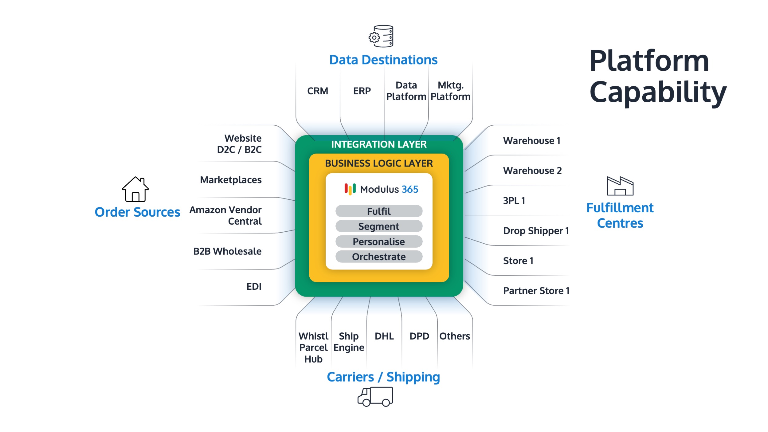
Modulus365 helps businesses connect order management, warehouse workflows, inventory visibility, barcode scanning, carrier integrations, returns, exception handling and fulfilment reporting.
By giving operations teams clearer visibility of order flow, warehouse progress, stock issues, carrier cut-offs, backlog, returns and exceptions, Modulus365 helps businesses build practical fulfilment dashboards that support better daily control and leadership decision-making.
For Sage businesses, Modulus365 can work alongside the ERP as the fulfilment operations layer.
👉 Learn more about Modulus365 for Sage.
Related FOA Guides
A fulfilment dashboard should connect daily control, weekly performance review and monthly leadership visibility. These guides explain the key metrics that should feed into a useful dashboard:
- How to Run a Weekly Fulfilment Performance Review
- Fulfilment KPIs Every Operations Leader Should Track
- On-Time Dispatch Rate: How to Measure and Improve It
- Backlog Metrics: How to Measure Fulfilment Risk Before Customers Complain
- Exception Metrics: The Hidden KPI Layer Most Fulfilment Teams Ignore
- Inventory Accuracy Metrics: How to Know Whether You Can Trust Your Stock
- Carrier Performance Metrics Every Fulfilment Team Should Track
- Fulfilment Cost Per Order: How to Calculate and Reduce It
Ready to Improve Fulfilment Visibility?
If your teams rely on spreadsheets, disconnected reports or manual updates to understand fulfilment performance, Modulus365 can help bring order flow, warehouse progress, stock visibility, carrier status and exception reporting into one clearer operational view.
Frequently Asked Questions
What is a fulfilment dashboard?
A fulfilment dashboard is a structured view of key fulfilment metrics, workload, risks and operational signals that show how orders, stock, warehouse activity, carriers, returns and exceptions are performing.
What should a fulfilment dashboard include?
A fulfilment dashboard should include order flow, backlog, on-time dispatch, order accuracy, exceptions, failed picks, carrier cut-offs, returns, inventory accuracy, carrier performance, capacity and fulfilment cost.
What should Ops leaders see daily?
Ops leaders should see orders due today, orders by fulfilment stage, orders close to carrier cut-off, picked-but-not-packed orders, packed-but-not-dispatched orders, backlog, failed picks and open exceptions.
What should be reviewed weekly?
Weekly fulfilment reviews should include on-time dispatch, order accuracy, perfect order rate, backlog trends, exception trends, failed picks, returns by reason, carrier performance and root-cause actions.
Why do fulfilment dashboards fail?
Fulfilment dashboards fail when they show too many metrics, use stale data, ignore exceptions, hide problems behind averages, lack reason codes or do not connect metrics to decisions and owners.